Discover how to use color in interior design to transform your home. Learn about the psychology of color, popular and trending color schemes for 2026, monochromatic vs colorful interiors, and practical design tips.
According to house painters in Raleigh, color is one of the most powerful elements in interior design.
It shapes mood, defines style, and can completely transform how a room looks and feels. Whether you love bold, vibrant hues or prefer the subtle elegance of a neutral palette, understanding color in interior design is key to creating a home that reflects your personality and lifestyle.
In this guide, we’ll explore why color matters, the psychology of color, reasons people embrace or avoid it, popular and trending color schemes (including forecasts for 2026), and practical tips for designing with both colorful interiors and monochromatic spaces. Let’s get started…
Why Color Matters in Interior Design
Color isn’t just decoration…it’s communication. It tells a story about who you are, influences emotions, and can even impact behavior. Here are the top reasons color plays such a vital role:
- Sets the Mood – Warm colors like red and orange create energy and vibrancy, while cool tones like blue and green promote calm and relaxation.
- Defines Space – Color can make a small room feel larger, a large room feel cozier, or visually separate open-concept layouts.
- Expresses Personality – From bold maximalism to minimalist chic, your color choices reflect your personal style.
- Enhances Functionality – Certain colors are better for concentration (blue, green), while others encourage social interaction (red, yellow).
- Creates Cohesion – A thoughtful color palette ties together different rooms and creates flow throughout the home.
Why Some People Shy Away From Color
Despite its benefits, many homeowners stick with beige, gray, and white walls. I’ve fallen into this habit at times, too. Why is this?
- Fear of Commitment – Bright wall colors feel permanent, and people worry they’ll tire of them.
- Resale Concerns – Neutrals are safe for staging homes and appealing to buyers.
- Overwhelm – Choosing from endless paint swatches and decor colors can feel intimidating.
- Minimalist Trends – The rise of minimalism and Scandinavian design encouraged clean, neutral spaces.
Still, shying away from color can sometimes leave spaces feeling flat or uninspired. The key is balance…learning how to add color in ways that feel safe yet impactful.
The Psychology of Colors in Interior Design
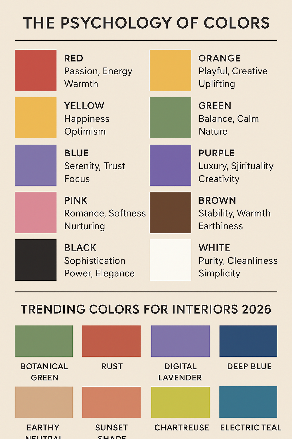
Color psychology explores how different hues influence emotions and behaviors. Here’s a quick breakdown:
- Red – Passion, energy, warmth. Often used in dining rooms and social spaces.
- Orange – Playful, creative, uplifting. Great for creative studios or family rooms.
- Yellow – Happiness, optimism, brightness. Works well in kitchens and small spaces needing warmth.
- Green – Balance, calm, nature. Perfect for living rooms, bedrooms, and home offices.
- Blue – Serenity, trust, focus. Popular for bathrooms, bedrooms, and offices.
- Purple – Luxury, spirituality, creativity. Adds drama to accent walls or decor.
- Pink – Romance, softness, nurturing. Trending in both modern and vintage-inspired designs.
- Brown/Neutrals – Stability, warmth, earthiness. Often used for grounding spaces.
- Black – Sophistication, power, elegance. Works in moderation for contrast or statement design.
- White – Purity, cleanliness, simplicity. Expands space but benefits from texture to avoid sterility.
Colorful Designs vs. Monochromatic Interiors
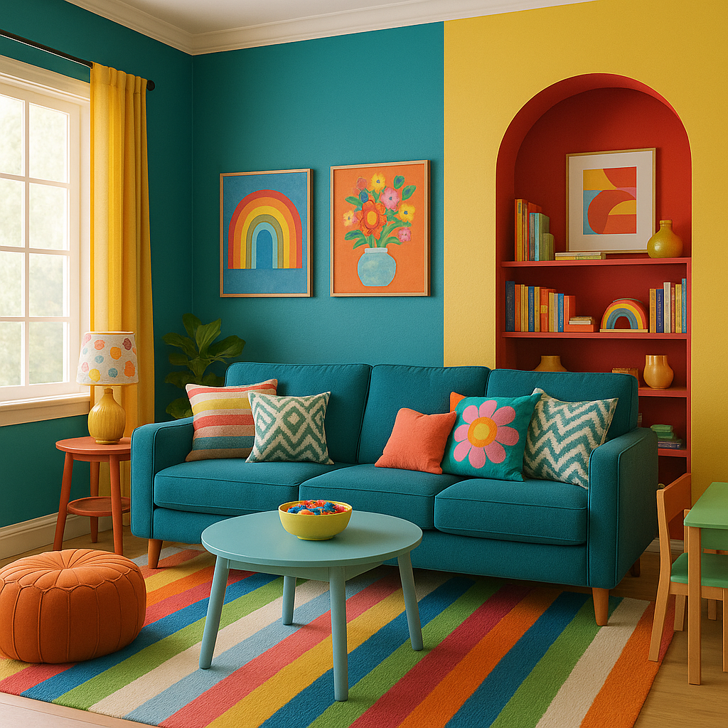
Embracing Colorful Interiors
Colorful design is about more than splashing paint on walls. It’s about intentional layering of hues, tones, and textures. Popular approaches include:
- Maximalism: Bold color mixing, patterns, and statement pieces.
- Eclectic interiors: Combining unexpected hues like teal and mustard for artistic flair.
- Accent walls: Adding one dramatic wall of navy, emerald, or terracotta while keeping the rest neutral.
The Appeal of Monochromatic Interiors
Monochromatic design uses one color in varying shades, tints, and tones. Benefits include:
- Cohesion – Creates a sleek, unified look.
- Flexibility – Easy to update with accents or seasonal decor.
- Calmness – Particularly in bedrooms and minimalist living rooms.
Example: A monochrome gray palette can feel modern and elegant when paired with different textures like velvet, linen, and concrete.
Popular Color Schemes in Interior Design
Some color schemes never go out of style.
- Neutral Palettes – Whites, grays, tans. Timeless, versatile, and easy to accessorize.
- Earth Tones – Browns, terracotta, olive, and ochre. Warm, grounding, and cozy.
- Black and White – High contrast, chic, and modern.
- Coastal Colors – Blues, whites, sandy beiges. Light and airy, reminiscent of the sea.
- Pastels – Blush, mint, lavender. Soft, calming, and youthful.
- Jewel Tones – Emerald, sapphire, ruby. Rich, dramatic, and luxurious.
Trending Color Schemes for 2026
Color forecasting agencies and design experts predict that 2026 interiors will feature a mix of biophilic-inspired tones and bold, expressive hues.
- Botanical Greens – Shades of moss, fern, and sage will dominate as people continue to connect with nature indoors.
- Sunset Shades – Rust, terracotta, and burnt sienna paired with muted blush or mauve.
- Digital Lavender – A soft purple tone predicted to dominate fashion and interiors.
- Deep Blues – Navy and midnight blue bringing depth and sophistication.
- Earthy Neutrals – Clay, sand, and taupe grounding brighter accents.
- Unexpected Pops – Vibrant chartreuse, electric teal, and magenta as bold accent choices.
How to Choose Colors for Your Home
Here’s a practical approach:
- Consider Room Function – Blue and green work well in offices; warm tones like yellow in kitchens.
- Use the 60-30-10 Rule – 60% dominant color, 30% secondary, 10% accent.
- Test Samples – Paint swatches look different in natural vs. artificial light.
- Balance Bold Colors – Pair vibrant walls with neutral furniture.
- Use Textures – Break up a monochrome palette with layered fabrics and finishes.
FAQs About Color in Interior Design
1. How do I choose the right color for a small room?
Light colors like soft whites, pastels, or pale neutrals can make a small room look larger. Adding a bold accent wall can also create depth.
2. Are dark colors bad for small spaces?
Not necessarily. Dark shades can make a small room feel cozy and dramatic if paired with good lighting.
3. What colors increase productivity at home?
Blue and green are linked to focus, calm, and creativity, making them ideal for home offices.
4. Are monochrome interiors boring?
No—monochrome palettes rely on texture, tone, and pattern to create visual interest. They can be incredibly chic.
5. What are the trending colors for 2026 interiors?
Expect biophilic greens, earthy neutrals, digital lavender, and bold accent pops like teal and magenta.
6. How do I add color without painting walls?
Incorporate color through rugs, throw pillows, art, curtains, or furniture. Accessories allow flexibility without permanent commitment.
7. Should all rooms in a home follow the same color scheme?
Not necessarily. Using complementary colors across spaces helps create flow, but each room can express its own personality.
Conclusion: Embracing Color in Interior Design
Color is one of the most transformative tools in interior design. Whether you choose bold, vibrant palettes or calm monochromatic tones, the colors you select can set the mood, showcase your style, and make your home feel truly yours.
Trends may come and go. 2026 is forecast to bring greens, earthy tones, and digital lavender into focus, but the most important factor is choosing colors that make you feel comfortable and inspired.
So don’t be afraid of color. Experiment, mix, and balance. Immerse yourself in color theory. The perfect palette can turn a house into a home.
Want more on color theory? Check out our post on how to use color theory in makeup!
Thanks for reading Color in Interior Design: How to Use Color for Beautiful, Functional, and Trendy Spaces on burlap+blue.