pantone's color of the year-2014
Alright, all...this is seriously one of the highlights of December for me...Pantone has chosen it's Color of the Year for 2014! Drumroll, please...
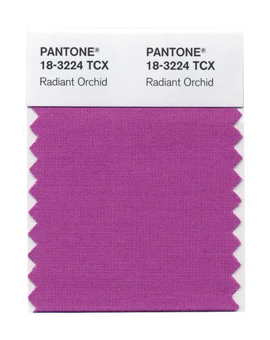 It's Radiant Orchid, y'all! From their press page:
“While the 2013 color of the year, PANTONE 17-5641 Emerald, served as a symbol of growth, renewal and prosperity, Radiant Orchid reaches across the color wheel to intrigue the eye and spark the imagination"
How do you guys feel about their choice? Personally, I rarely ever use purples in my decorating, so I'm very curious to see if this will change. I'm always a bit fascinated by color trends....remember when brown was the go-to neutral instead of gray? Or when lighter, muted colors (think robins egg and sage green) were the in-colors, and usually paired with brown? I am enjoying this trend towards the bolder and more unexpected, though!
Can't wait to see how the design world embraces this pick!!
xoxo
Interesting. I'm not a huge go-to purple person, either. Although, I NEVER thought I'd be obsessed with Gold and now I'm gold crazy. Funny how that happens.
Me. Too. It's crazy how color trends come and go...It'll be interesting to see how this newbie is incorporated into our home decor-I'm kinda excited about the possibilities! xoxo
I'm not a purple-person, and I tend to still like blue, green, aqua, red, orange, etc....jewel tones are not one of my favorite décor trends. I guess they are too "dark" for me~~I like brighter, cheerier colors!! 🙂
Unfortunately, it does nothing for me but I'm sure I'm in the minority and those who feel otherwise will make incredibly wonderful designs using this color.
I am not a purple person either...I love more nature inspired colors, but I would love to see how it will be used, as i am always open to new ideas.
i am always excited to see what color they will pick. i was surprised this year, however i thought it was more orchid, as in from the early 80s. i think this color always looks good with orange!